WCE
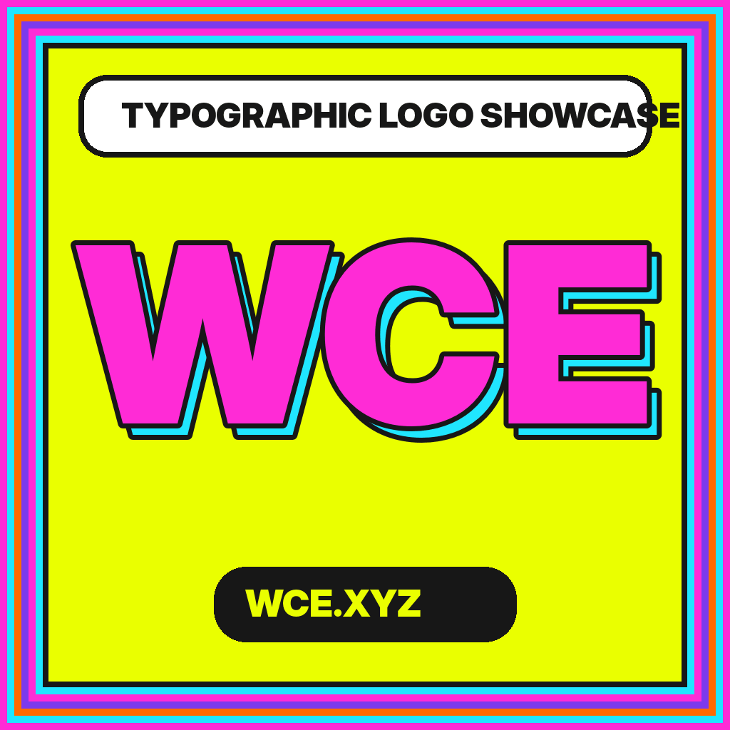
WCE typographic logo showcase
WCE
WCE
three letters.
many systems.
WCE.XYZ is a bright visual laboratory for typographic logos, lettermarks, wordmarks, monograms, spacing, and responsive brand systems. Every study starts with the same three letters so the design decisions remain visible.
WCEeditorial contrast
WCEchromatic offset
WCEmodular signal
Featured specimens
One sequence. Six radically different voices.
Compare how serif anatomy, condensed width, monospaced rhythm, outline, color offset, and italic motion alter the same WCE skeleton.
WCE
WCE
WCE
WCE
WCE
What the showcase isolates
The design choices hiding inside three letters.
A controlled letter sequence makes type decisions easier to study. W exposes diagonals and width, C exposes curve and aperture, and E exposes horizontal rhythm and terminal logic.
Structure
Compare serif, sans serif, mono, display, and hybrid skeletons without changing the letter content.
Spacing
See how diagonal-to-curve and curve-to-stem pairs require different optical kerning.
System
Move beyond a single lockup into responsive, monochrome, favicon, and production-ready behavior.
Letterform method
Sketch broadly. Build simply. Correct optically.
The WCE process begins with a role, explores many thumbnail structures, selects one dominant construction rule, and then tests the result in vectors, one color, small sizes, and real layouts.
Find the rule
Shared angle, terminal, proportion, aperture, or overlap.
Test the gaps
Negative space must remain clear before color is added.
Build the family
Primary, reverse, compact, and favicon masters share one identity.
The WCE Letterform Journal


Practical articles for typographic logo systems.
Ten in-depth guides cover sketching, type selection, kerning, monograms, variable fonts, one-color testing, color, favicons, grids, and common mistakes.
Ten Common Typographic Logo Mistakes—and How to Fix Them
Diagnose ten recurring problems in short lettermarks: default spacing, style overload, weak small-size behavior, inaccessible contrast, file confusion, and more.
Grid Systems for Balanced WCE Lettermark Construction
Use modular grids, alignment zones, repeatable angles, and optical correction to construct a balanced WCE lettermark without letting geometry overpower the letters.
Making a WCE Logo Work at Favicon Size
Adapt WCE for 16–64 pixel contexts by simplifying geometry, widening apertures, managing browser formats, and designing a dedicated micro-mark instead of shrinking blindly.
Frequently asked
About the WCE showcase.
The project is an editorial study of typographic form, not a directory of trademark-cleared commercial logos.
What is the WCE typographic logo showcase?
WCE.XYZ is an editorial design showcase that uses the same three letters—W, C, and E—to compare serif, sans serif, monospace, display, and experimental logo treatments.
Are the logo studies downloadable brand identities?
The studies are published for visual inspiration and design education. They are not presented as commissioned identities, trademark-cleared marks, or ready-made logos for a specific organization.
Why use the same letters in every study?
Keeping WCE constant makes differences in width, contrast, spacing, curve, terminal, and composition easier to compare. The letter sequence acts like a controlled typographic specimen.
Does WCE.XYZ cover logo design process?
Yes. The site includes a step-by-step process page and a ten-article journal covering sketching, kerning, monograms, variable fonts, color, grid construction, small-size testing, and production.
Can a three-letter logo use multiple styles?
It can, but the styles need a shared rule such as common weight, angle, proportion, or terminal logic. The showcase demonstrates both coherent combinations and deliberately experimental contrasts.